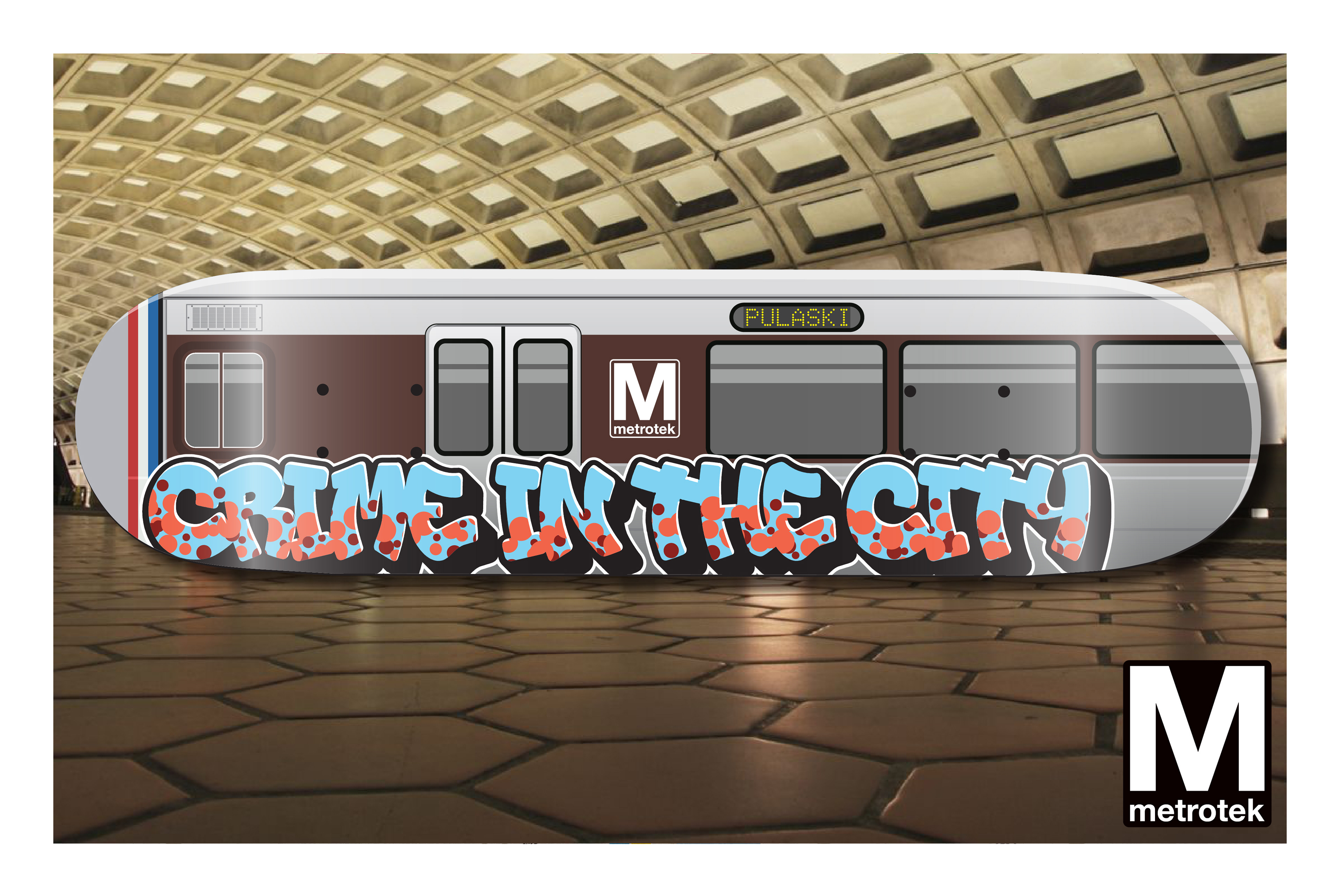
"Crime in the City" skateboard deck.
Client: Metrotek. 2018. Created in Adobe Illustrator CC.

"Alive With Pleasure" proposed skateboard deck graphic.
Client: Catalyst Skateboards. 2008. Created in Adobe Illustrator.
Wreckd Skateboards, with it's trademark backwards letter K, was a collaboration between myself and a friend to create a small East Coast skateboard company that produced skateboard decks, t-shirts, and stickers. Wreckd's design aesthetic was created to appeal to young urban teens that favored branding with a graffiti and street inspired style.
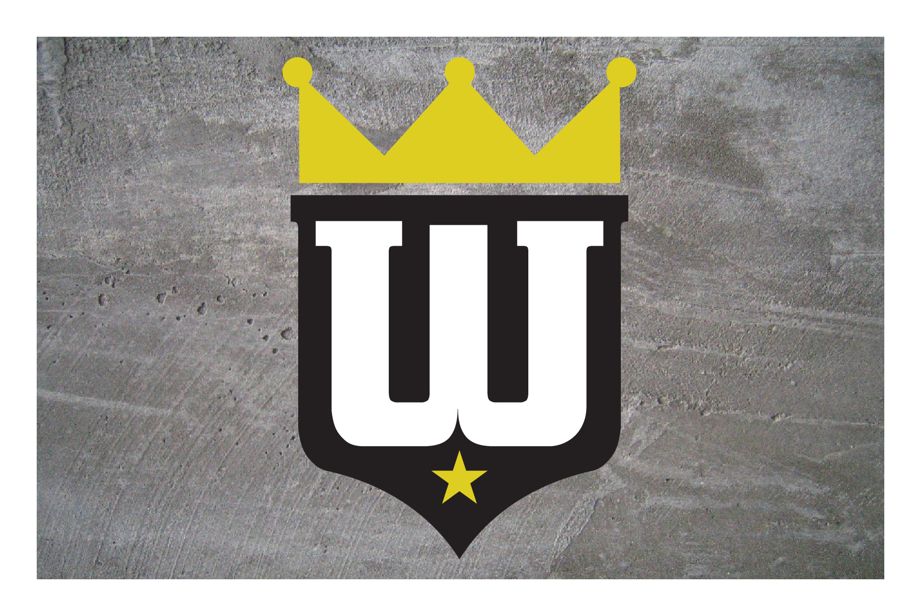
Wreckd's main graphic was composed of a shield, a crown, a star, and the letter W. Black and yellow were chosen as two of the brand's colors to create contrast, but to also create a feeling of motion.
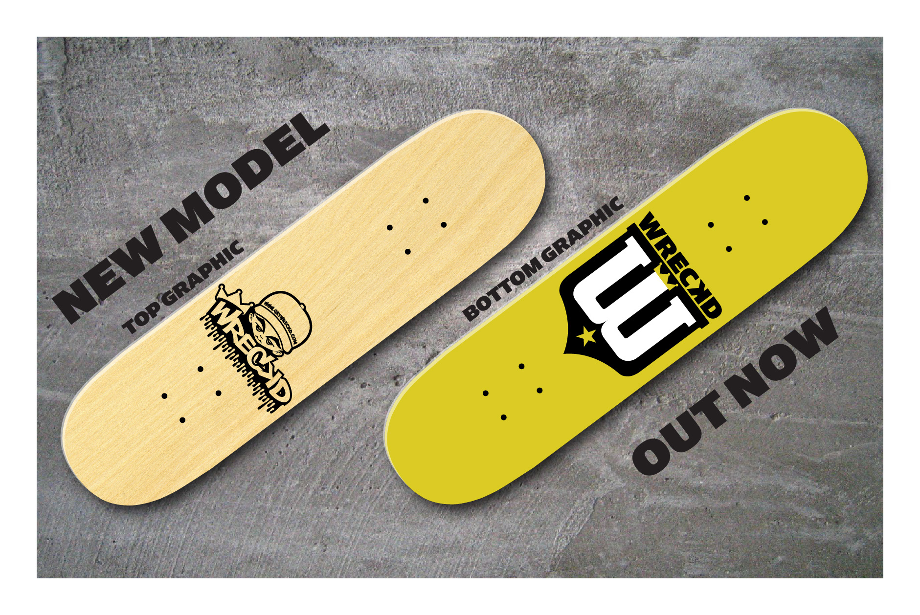
Once the logo was created, we began the process of designing our first product, a skateboard deck. The bottom graphic was our logo and the top graphic was a graffiti inspired design with a character, dripping letters and a crown balanced on the letter W. These were manufactured for us in the U.S. then distributed to DC area skate shops.
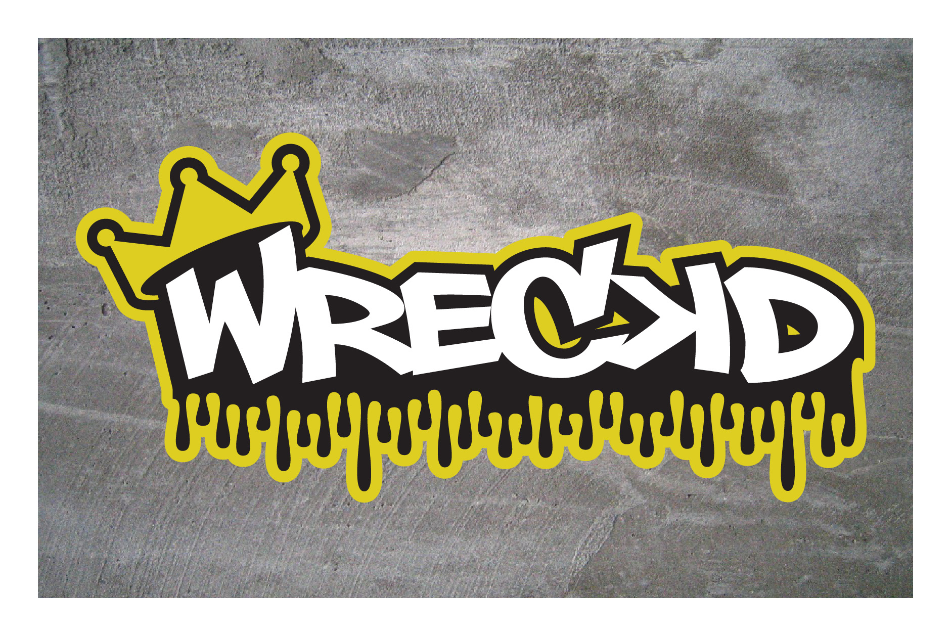
Another iteration of the Wreckd logo. We felt the branding was strong as the backwards K and crown was recognizable as well as the vibrant, high contrast color scheme.

Another version of the Wreckd logo, with more of a stylized script lettering, and the crown moving to the right side.
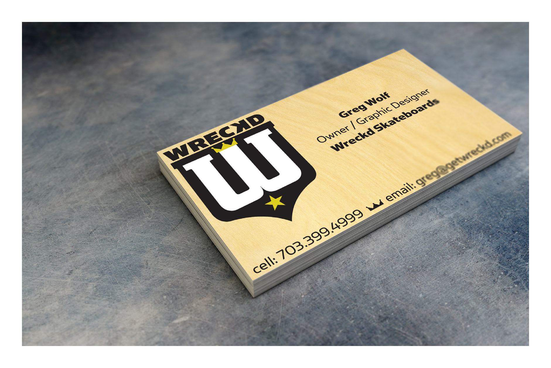
My personal business card as graphic designer and half owner of Wreckd.

A grey and black Wreckd logo, keeping only the original backwards letter K.
A more street art approach to this logo was used.
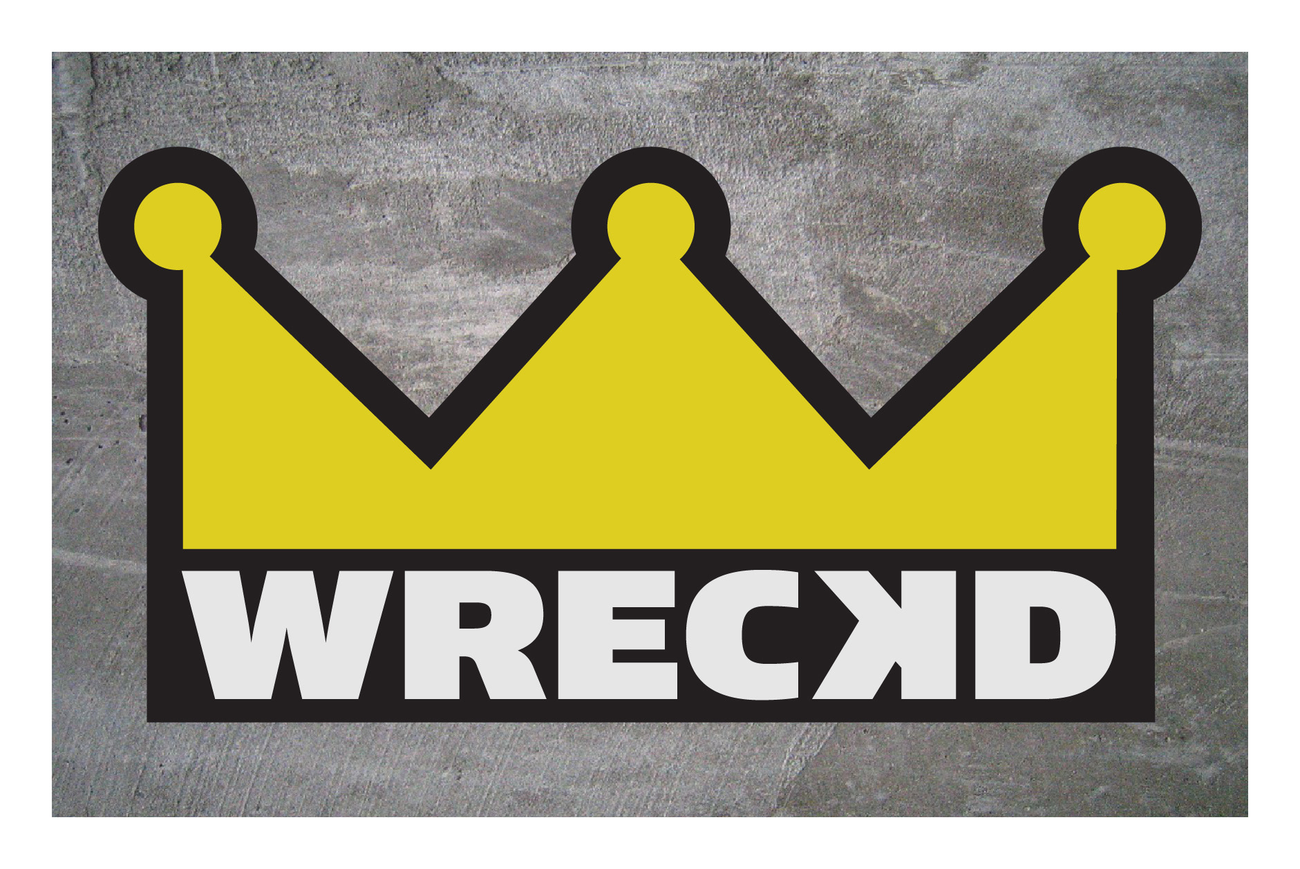
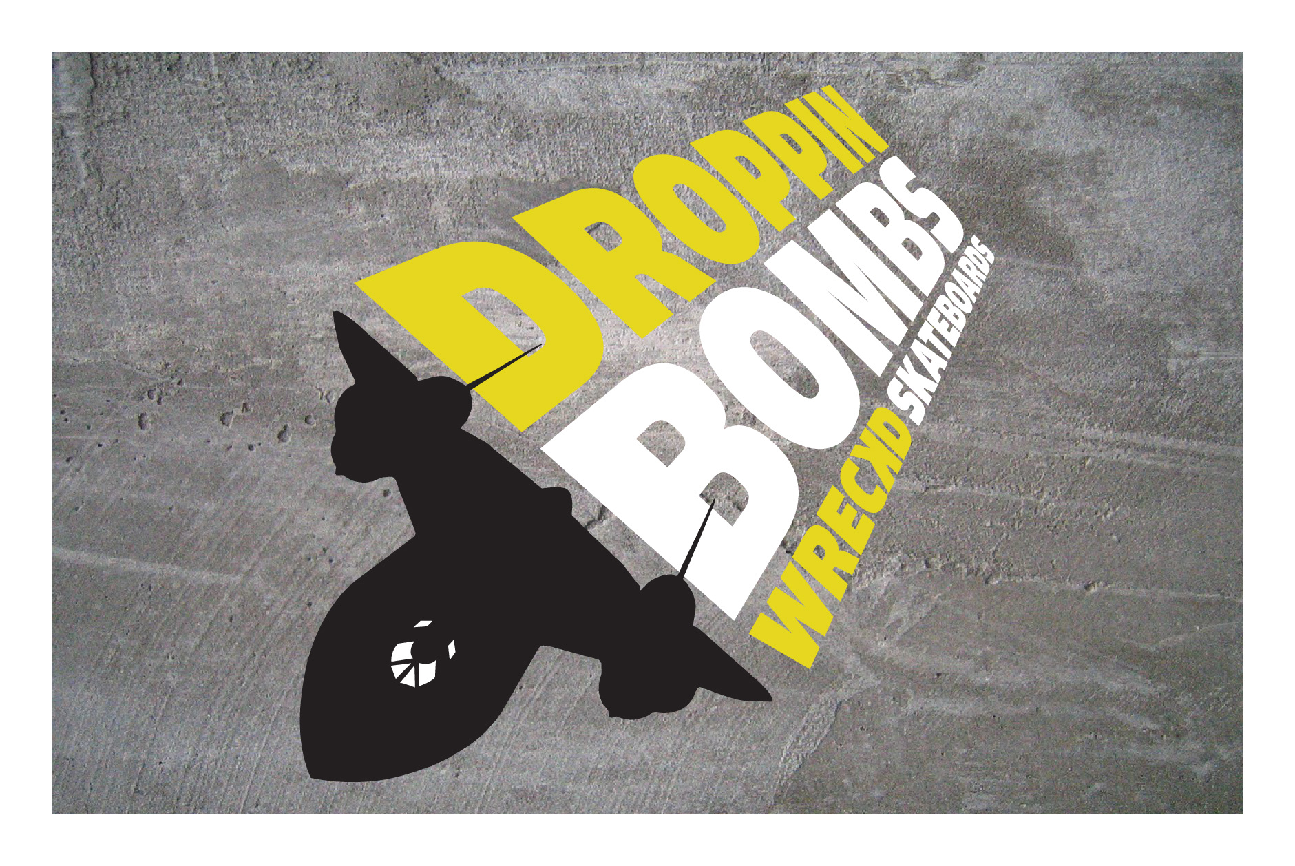
Part of the top graphic of the Wreckd skateboard deck as a solo graphic.
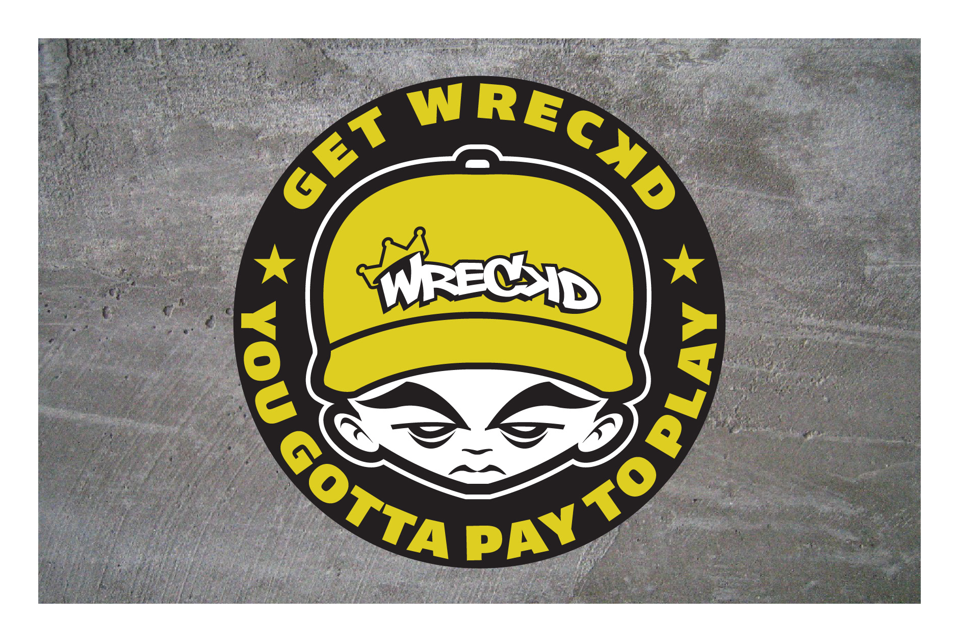
A sticker design for Wreckd included the slogan "You gotta pay to play" meaning that sometimes you got hurt when trying to do amazing things.

One of the final logos I created for Wreckd, the XTR Concave Formula logo would be used on stickers that would be given away to promote Wreckd's new concave formula on the next round of decks to be sold.